Thursday, April 24, 2014
For the Love of Color, a class at Peters Valley School of Craft
I'm happy to be teaching at Peters Valley School of Craft in Layton, New Jersey this June. It will be my first experience at the school and I'm looking forward to it. Here's a link to the class description.
I gave the class the title, For the Love of Color, and I do indeed love color. My work is often subtle in color arrangement since most of the time I work from nature as the subject/source for my tapestries. However, my color choices almost always are made with a mixture of colors in my weft bundles as I use two to five or six strands in each (number of strands depends on the warp sett and the type of weft I'm using). I've found that the appearance of color in the woven surface of tapestry is different than when seeing the color on the cone or in a ball of yarn. Developing a sensitivity to what to expect with color blending in the weft is key to the tapestry maker, I believe. And, not only does a particular weft blend need to "work" on its own but it also must participate well with other colors surrounding it.
When I was at the university one of the courses I taught was a basic design course that focused on color. Most of the exercises assigned to the students were done with paper or paint, and the ideas and theory of color we studied were based on the work of Johannes Itten and Josef Albers. Though my many years of planning and doing this course I learned as much as I was trying to teach. I've attempted to put the theories of color contrasts and harmony to use in my own work. I find it ever challenging and always exciting to take a group of yarns and see how to turn them into suggestions of something else entirely. The multiple strands of neutrals with a little orange thrown in to suggest the iron oxide in stones, for instance:
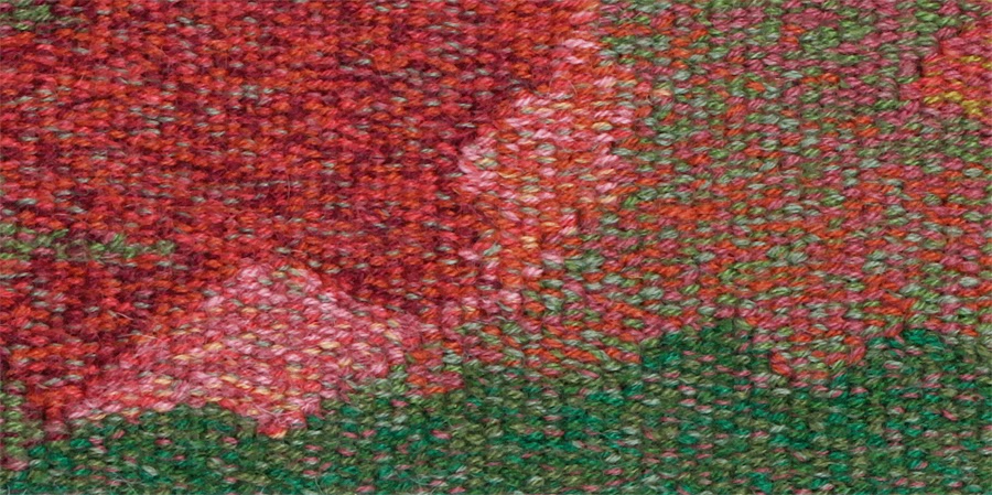
Or how a complementary pair (red and green in this case) can be used together with variations in amounts of intensity and value to give a subtle richness to the mixtures:
How contrast of hue with most at full intensity can give a liveliness to the image, suggestive of the exuberant combination of fabrics that were used in the quilt that was the basis for this tapestry image:
I'm going to be making new color examples as samples in weft-faced weaving (mostly tapestry) for the upcoming class and I'm quite excited about starting with those. Color study, here I come!
Subscribe to:
Post Comments (Atom)


No comments:
Post a Comment